Phasor Analysis
Contents
The phasor analysis window can be opened from the PAM main window by clicking on Advanced Analysis -> Phasor or from the command window by typing in Phasor.
The phasor approach to FLIM uses the Fourier space to analyze lifetime image data in a graphical way without the use of fit models, making it less biased compared to convolution or tail-fitting approaches. An introduction and description of the approach can be found in [Redfort2005] and [Digman2008]. An example application of the features of the Phasor analysis in PAM is featured in [Schrimpf2016].
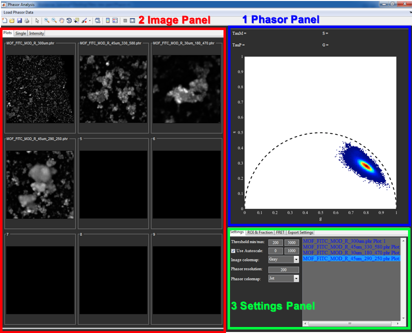
The main gui of Phasor.
The Phasor Analysis window is divided into three main panels:
- Phasor Panel:
- Plots phasor histogram of activated files.
- Image Panel:
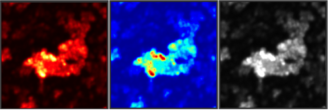
- Plots: Displays up to 9 images
- Single: Larger representation of currently selected file
- Intensity: Plots for Intensity vs. Frequency/G/S
- Setting Panel:
- Settings: File list and general display settings
- ROI & Fraction: Display settings for ROIs and Fraction Line
- FRET: Settings for FRET estimator
- Export Setting: Controls for Export properties
General Data handling an plotting
Loading Data
To load new data, click on Load Phasor Data in the menu bar and select the files to be loaded. Currently the program only supports phasor files created with PAM (*.phr). The selected files will be added to the File List in the Settings tab.
Phasor now also supports spectral phasor data with the ending *.phs. Either spectral or lifetime data can be loaded at once. Loading the other type will clear previously loaded files.
Removing Data
To remove files from memory select them in the File List and press the ‘del’-Key.
Plotting multiple intensity images
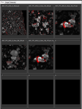
The Image panel.
A newly loaded file will be automatically plotted in the first empty plot in the Plots tab. Files currently displayed are indicated with a blue font and the number associated with the plot in the File List. To free up plots for other files, press the ‘leftarrow’-Key while the File List is active. This deactivates the selected files, indicated by a white font. Deactivated files will not be plotted and not used for calculating the Phasor histogram. Pressing the ‘+‘-Key will also remove the selected files from being plotted, but will keep them active. Active, but not plotted files are shown in a red font. Use the ‘rightarrow’-Key to assign an unplotted file to a free image plot.
Plotting individual intensity images
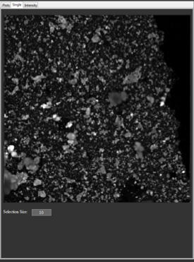
Plotting a single file.
To look at one individual file at a time in a bigger plot, select the Single tab in the Image Panel. Now, only the first selected file in the File List will be plotted and used to calculate the Phasor histogram, independent of whether it is active or not.
Plotting individual image sub-regions
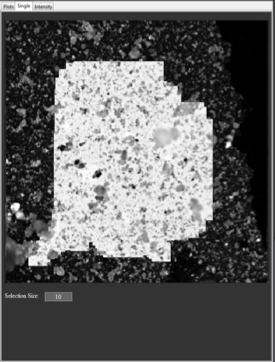
Plotting an image subregion.
It is also possible to exclude pixels or regions of the image from the Phasor histogram. To do that, click and hold the middle mouse button in the Single plot. A square region around the cursor will be unselected and excluded when calculating the Phasor histogram (but only when in the Single tab). The size of the excluded region can be adjusted with Selection Size. To reselect individual regions, press and hold the left mouse button. Double clicking the Single plot will reselect the whole image. Clicking the left mouse button when all pixels are selected will unselect all pixels. Unselected regions are shown in inverted RGB colors (corresponding to [1 - R, 1 - G, 1 - B]).
Plotting the phasor center of mass

Plotting center of mass.
To show the center of mass (CoM) of the individual files in the phasor histogram, select the option in the popupmenu in the bottom of the Settings tab. When either a pixel and photon weighted CoM display is selected, the program displays a marker indicating the CoM for each file used in the calculation of the phasor histogram. The calculation takes both the photon thresholds als well as the selected sub-region into account. To change the marker shape, use the popupmenu next to the CoM Selection. A right click on the shape menu opens a context menu with further options, like size or color of the marker. The marker properties will be applied to all files selected in the File List.
Changing image display styles
Intensity images are by default displayed using an autoscaled Gray colormap. To set the contrast manually, uncheck Use Autoscale in the Settings tab and type in lower and upper counts limits. Besides Gray, there are three standard Matlab colormaps Jet, Hot and HSV, as well as Black, a colormap that displays the image as black (sometimes useful in combination with ROIs). The different colormaps also behave differently when ROIs are selected, as is described in chapters 2.2, 2.4 and 2.6.
Available colormaps.
Plotting Phasor Histogram
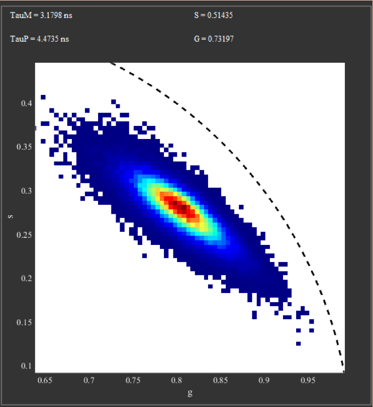
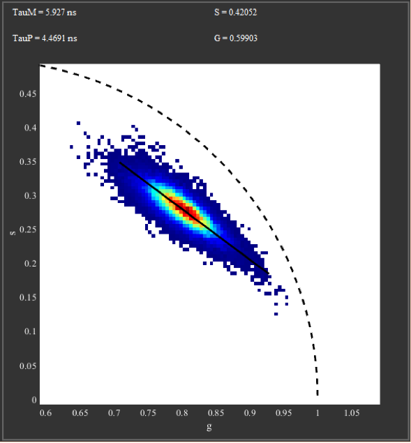
The phasor plot.
The Phasor histogram is always calculated and plotted automatically. The black dotted line corresponds to the universal circle, highlighting all possible phasors for monoexponential decays. For spectral phasor data, the universal circle is remove and a circle with radius 1 around the origin is plotted to indicate all possible positions.
Depending on the selected tab in the Image Panel different data is used for calculation:
- Plots: All active files (blue or red font in File List) are used.
- Single: Only selected regions of first selected file in File List are used.
- Intensity: All selected files in File List are used.
In all cases all pixels outside the threshold (set via Threshold min/max) are discarded. Furthermore, values far outside the normal range (g or s <-0.1 or >1.2) are also not plotted. For spectral data this range is instead -1 to 1. The bin size of the Phasor plot can be adjusted using Phasor resolution. The value determines into how many bins the range 0 to 1 for both g and s is divided. Since the actual range is -0.1 to 1.2, the actual resolution is 1.3 times that value (Caution: The resolution must always be a multiple of 10, otherwise the program generates an error). As in the case of the images, different colormaps can be selected using Phasor colormap, with Jet as default.
ROIs, Fraction Line and FRET
Selecting a Region of Interest (ROI)
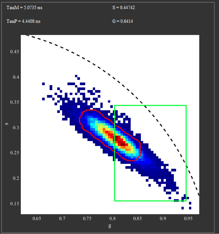
Selecting ROIs in the Phasor plot.
It is possible to select and plot up to 6 different ROIs in the Phasor plot at the same time, each with one of two possible ROI shapes.
To select a ROI, press and hold keys 1-6 (Numpad also works). Next, click with the mouse inside the Phasor plot and select a ROI by moving the mouse, while keeping the mouse button pressed. If you use the left mouse button, the ROI will be a rectangle, while the right mouse button selects a roughly ellipsoid region. The diameter of the ellipsoid can be set for each ROI individually in the ROI&Fraction tab with the Size parameter.
There are two ways of unselecting ROIs: To completely delete a ROI, press and hold the number key and click once in the Phasor plot. The second method deactivates the ROI, while keeping its position in memory for later use. Clicking with the mouse on the respective ROI Button in the ROI&Fraction tab will toggle the corresponding ROIs. Hereby, left and right mouse buttons correspond to the rectangular and ellipsoid shapes, so that it is possible to keep both rectangular and ellipsoid ROIs.
Displaying ROIs
In the intensity plot, the color of pixels that have a phasor inside a ROI and that have an intensity within the set threshold, is changed to the color of the corresponding ROI. In case of overlapping ROIs, the resulting color is the average of the ROI colors.
The image colormap Gray comprises a special case. Here, the pixel color is the scaled intensity times the RGB values of the ROI color, therefore the brightness corresponds to pixel counts, while the ROI is indicated by the hue.
The line width and style of the ROI lines in the Phasor Plot can be changed in the ROI&Fraction tab with the Width and Style parameters, respectively. To assign a different color, click with the middle mouse button on the ROI Button and select a color from the menu.
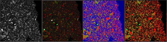
Displaying phasor ROIs in the intensity images.
Selecting a Fraction Line
Using the fraction line.
Since varying ratios of two components result in straight lines in a phasor plot, it is also possible to visualize these ratios with a straight line. Start selecting a Fraction Line by pressing and holding the ‘0’-Key (Numpad also works). Next, click with the mouse at the start position inside the Phasor plot and moving the mouse to the desired end position, while keeping the mouse button pressed. Clicking the left or right mouse buttons when selecting the Fraction Line will result in the reverse color order (explained in chapter 2.4). There are two ways of unselecting the Fraction line: To completely delete it, press and hold the 0-key and click once in the phasor plot. The second method deactivates the Fraction Line, while keeping its position in memory for later use. Clicking with the mouse on the Fraction Button in the ROI&Fraction tab will toggle it.
Displaying a Fraction Line
Displaying the fraction line in the image.
After selecting a Fraction Line, pixels in the intensity plots will be color coded according to their position on the line. To be precise, the program determines for each pixel the closest point on the fraction line and assigns them a color corresponding to that point. Points further away than the Fraction Size set in the ROI&Fraction tab are not color coded. The colormap used for Fraction Line can be set with the popupmenu in the ROI&Fraction tab. The image colormap Gray comprises a special case. Here, the pixel color is the scaled intensity times the RGB values of the Fraction Line color, therefore the brightness corresponds to pixel counts, while the position in the line is indicated by the hue. The line width and style of the Fraction Line in the Phasor Plot can be changed in the ROI&Fraction tab with the Width and Style parameters, respectively. To assign a different color, click with the middle mouse button on the Fraction Button and select a color from the menu. Note that this color only affects the line plotted in the Phasor Plot, not the intensity images.
Hint
You can use custom colormaps to use for color-coding with the fraction line. To do so, create a colormap array (n x 3 double array of values between 0 and 1) in the matlab workspace and copy the data to the variable Phasor_Colormap. Then, declare Phasor_Colormap as a global variable. In the Phasor window, select Custom for the fraction line colormap. The program will then store the custom colormap for subsequent sessions.
Selecting a Triangular Mixture
With a single phasor plot it is possible to unambiguously determine the fractions of a mixture of three components, as long as all three phasors of the base components are known. To display these mixtures, use the 7-, 8- and 9-keys to define a triangle. For this, hold down the corresponding key and click into the phasor histogram. The vertex of the triangle will then be placed at that position.
Displaying a Triangular Mixture
Once the triangle is defined, the program will color-code the images according to the pixels position in this triangle. For this, it calculates the relative fraction of each components and sets the red (7-key), green (8-key) and blue (9-key) color value to that fraction. As with the other display types, this RGB value can be adjusted with the pixels intensity for gray-scale displaying or as a flat value for all other colormaps.
Selecting FRET Trajectory
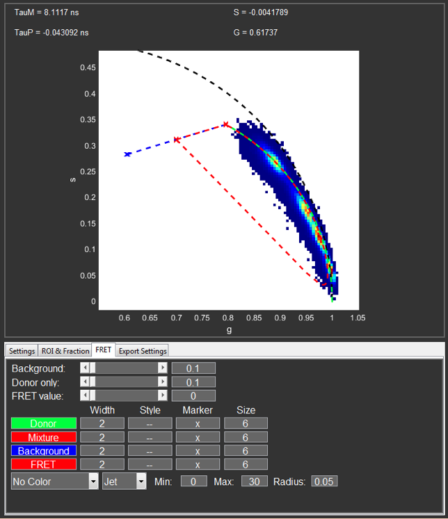
FRET trajectory in phasor plot.
The phasor program is also able to calculate and display a curved quenching trajectory, mostly used for FRET. To start this type of selection, right click the phasor histogram at the position of the unquenched donor position and select Set Donor. The display will switch to the FRET selection mode and display several different lines and points. The green curve represents the ideal quenching curve of the pure donor (indicated by a green x) between 0 and 100% quenching. The blue line represents a mixture of the pure donor and a background contribution. The background phasor can be selected with right click the phasor histogram and selecting Set Background. The red curve represents the real FRET trajectory that takes into account the contribution of the background and a donor only species. These contributions can be adjusted with the corresponding sliders in the FRET tab. The display parameters can be changed in the FRET tab and the color can be changed with a middle mouse button click on the corresponding box.
Calculation of FRET Trajectory
For a mono-exponential decay, the phasor position as a function of quenching can be easily calculated. However, for a phasor inside of the universal circle no unique quenching trajectory exists, since the phasor can be a result of different combinations of lifetimes and fractions. Still, most of these combinations will have very similar trajectories. Therefore, the program assumes that the phasor is a result of a mixture of a mono-exponential decay \(\tau\) and a contribution with a lifetime of 0. It then calculates the simple quenching for the mono-exponential decay \(\tau\) and generates the trajectory by assuming a constant fraction between the two components (\(\tau\) and 0). This pure FRET trajectory is plotted as a green curve. In reality, most measurement will not only contain the FRETing or quenched species, but also contributions from the background and unquenched donor molecules (due to missing of bleached acceptor dyes). The program accounts for that based on the values set by the user, resulting in the real FRET trajectory shown in red. Hereby, the contribution of background and unquenched donor are assumed to be constant. As quenching increases, the brightness of the FRETing species decreases, also decreasing its relative contribution to the photon stream. Therefore, the trajectory curves back towards the phasor of the constant contribution.
Displaying FRET Trajectory
The FRET trajectory can be displayed in two different ways. The first way works the same way as the fraction line, just with a curved line. To select this method of display, select FRET Line in the bottom left corner of the FRET tab. To increase the contrast, the relevant section of this line can be set with the Min/Max values. The colormap used here can be selected with the corresponding popupmenu.
The second way of highlighting the FRET trajectory is the FRET Spot. Here, a circular area in the phasor plot around the selected position of the real trajectory is highlighted in the images with the corresponding color (just like a ROI). The size of the spot, as well as the maximal distance from the FRET line can be set with the Radius value.
Hint
You can use costom colormaps to use for color-coding with the FRET line. To do so, create a colormap array (n x 3 double array of values between 0 and 1) in the matlab workspace and copy the data to the variable Phasor_Colormap. Then, declare Phasor_Colormap as a global variable. In the Phasor window, select Custom for the FRET line colormap. The program will then store the custom colormap for subsequent sessions.
Additional functions
Exporting Images
Any image that is currently plotted in the Phasor program can be exported to a new MATLAB figure or as a TIFF file by right clicking on the image and selecting the corresponding option. The images are exported as RGB data, so that the direct information about the pixels counts is lost.
Exporting Phasor Histograms
The phasor histogram, including all ROIs and other markings, can be exported as a separate MATLAB figure via a double click into the phasor histogram. The size and setting of the new figure can be set in the Export Settings tab.
Averaging Images
In some cases, the pixel counts in the image might be too low for an adequate analysis of the data. To improve the signal-to-noise the user can use a running average of 3x3 pixels on the phasor data. This can be via a right mouse button click in the File List in the Settings tab and selecting Average Pixels. This creates a new file that usually shows a narrower spread in the phasor histogram. However, this decreases the spatial resolution of the phasor data, but the resolution of the intensity image is maintained.
| [Redfort2005] | Redfort, G.I and Clegg, R.M. Polar Plot Representation for Frequency-Domain Analysis of Fluorescence Lifetimes. J Fluoresc 15(5), 805-815 (2005). |
| [Digman2008] | Digman, M.A, et al. The phasor approach to fluorescence lifetime imaging analysis. Biophys. J. 94(2), L14-L16 (2008). |
| [Schrimpf2016] | Schrimpf, W. et al. Investigation of the Co-Dependence of Morphology and Fluorescence Lifetime in a Metal?Organic Framework. Small 12(27), 3651-3657. |